Tax Season Dashboard

Summary
Project details
Company
Computershare
Timeline
Jul 2024 - Nov 2024
Overview
Every year around tax time, Computershare was experiencing a ~25% increase in calls which required hiring and training additional temporary staff costing the company $9-10MM. We wanted to reduce these costs and keep working towards Computershare's longer term goal of increasing user self-service by expanding and improving our digital services.
My role
UX/UI Designer
I was included in the workshop that came up with a multi-pronged solution to reduce costs to the company and improve user experience. I ended up being responsible for the design of the tax season dashboard. I took into account what users said they wanted to do when they called us, what else the business wanted to nudge them to do, and basic design principles when designing the solution.
Key deliverables
-
Analysis of comparable competitor dashboards
-
UX with choices informed by call center data
-
UI designs
-
Presented designs to stakeholders
-
Worked with our developer to ensure the live site met the approved design standards
Results
~20k increase
in unique visitors Jan '25 compared to Jan '24
8-33% click-through
rate on other related tasks featured on the page
$1.5MM saved
on temporary staffing costs for FY25
Process
Step 1 Workshop
I joined the project once the business had signed off on it and the first thing the team did was hold a workshop to gather ideas on how we could solve the business and customer needs. We started with identifying the top reasons our customers were calling in around tax time and added ideas on how, where, and when we could redirect them towards a self-service option.
We ended up with six main reasons our customers were calling in:
-
Tax form questions
-
Need a new statement
-
Due diligence questions (ex: what address do I have on file)
-
Cost basis questions
-
Make a transfer/sale
-
See transfer/sale status
With the jobs to be done defined, we started brainstorming ways we could improve or create new experiences that would enable our users to be more self-sufficient and allow Computershare to focus its resources where they were most needed.


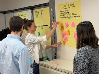
At the end of the workshop, we reviewed our notes and noticed the same solution themes kept popping up across the various call drivers:
-
IVR improvements
-
Chatbot improvements
-
SMS/Email/Mail communications
-
Web landing page/Web improvements
-
Education
We each picked up the work we could contribute to based on those themes and for me, that ended up being designing the web landing page - the goal of which would be to allows users to find needed tax information on their own timeline and nudge them towards other relevant tasks/business goals.
Step 2 Analysis & planning
Before I could design anything I needed to better understand who would be coming to the dashboard, why, and what information they'd need to be able to find.
I used my notes from the workshop to create two main user personas:


In addition to understanding our users, I also needed to understand Computershare’s existing tax-related resources. I found that while a tax page did exist, it wasn't easy to get to being buried under a few layers of links and contained only a few high-level bits of information that mainly just linked out to more pages. Not a very one stop shop for tax preparedness.
Since the existing tax page was so basic, I also conducted a competitive review of comparable tax-related resources from other financial services providers. This allowed me to look for any common patterns, baseline user expectations, and opportunities for improvement on our new dashboard.

Lastly, I needed to gather and prioritize what information and actions would actually end up on the page. I grouped the information into required vs. nice to have, and the features into primary vs. secondary so I could create the right hierarchy in the design.
Information
Required
-
Important tax dates
-
Understanding your tax forms
-
Finding cost basis information
Nice to have
-
"will I get X form" table
-
FAQs on general tax inquiries
Features
Primary
-
download tax forms
-
update your address
Secondary
-
sign up for text/email notifications
-
replace a check
-
sign up for Investor Center
Step 3 Page layout & UX
With a solid understanding of everything, I could start piecing together layout ideas.
For a basic layout, I took inspiration from other existing Computershare pages that presented actions in individual cards. I kept those and the most important information at the top of the page. The customer relations team was working on creating a "Tax 101" video to include but we weren't sure if it would be done by the time the dashboard would launch so I made two versions to review - one with space for the video and one without.
I also had the idea of bringing some of the actions directly onto the dashboard to remove a layer of friction and make it easier for users to complete those tasks - why click a link to update an address if it was an option on the page the user is already on?
After reviewing that version with the business and development teams, it was determined to be too much effort for the amount of time we had and there were some concerns it could distract from the main draw of the tax page (getting tax information) so we went forward with the actions in cards option.
Placing the rest of the secondary information and features on the page was fairly simple after the priority items had been arranged.


Step 4 UI Screens
Once the general page layout was approved, I moved on to creating a UI that the developer could use to bring the dashboard to life.
While I worked on the UI, I kept in touch with the product owner to ensure it was coming together the way they envisioned. There were tweaks along the way that also impacted the overall layout - like switching the tax form release schedule with the "will I get X tax form" table.
Eventually we landed on the final designs shown below and I created both light and dark mode versions as Computershare was looking to implement dark mode across their applications.


Standard header
Primary actions
"will I get X tax form" table
Video resources
Nudge for investor center
FAQs
Tax form release schedule
Additional resources
Additional actions
Standard footer
Results
An increase of ~20,000 more unique visitors in January 2025 compared to January 2024.
A decrease in call volume that was enough to justify adjusting the amount of temporary staff to hire the next year. This led to a cost savings of $1.5MM for the company.
An 8-33% click-through rate on the page to the other related tasks prioritized on the dashboard. The most frequent one being address update, which had the added bonus of increased accuracy of our stored user contact data.
Post release update
There were more changes made the year after launch. The below design is the result of those changes which included simplifying the page by combining the tax form release schedule with the "will I get X form" table, removing unnecessary descriptive text where possible, and condensing the links to additional actions and resources.
